Lillian Grace on the FigureNZ homepage. Photo: Screen shot
If, as C P Scott said, facts are sacred, then Figure.NZ is a virtual cathedral of statistics.
Now in its fifth year of existence the site is home to 44,000 graphs and charts. Want to know the region with most ministers of religion per one thousand residents? That would be Nelson with 2.52 compared with just 1.32 in Gisborne region with the fewest.
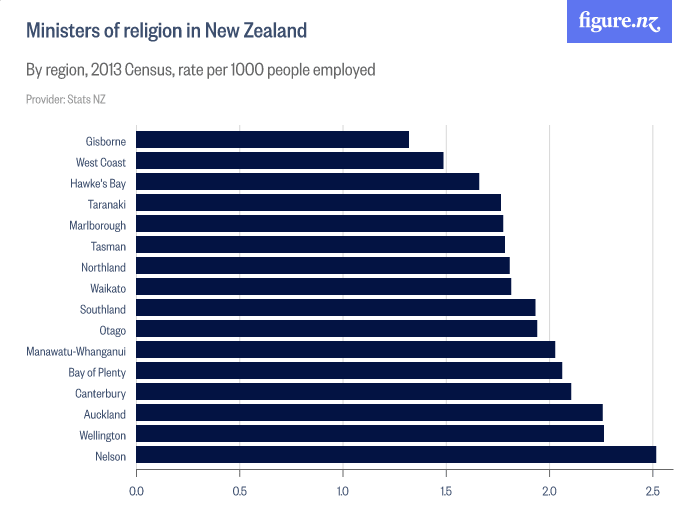
Chart: FigureNZ
How about the number of hectares planted in feijoas? As of last year it was 181 - down from 250 a decade ago.
Last week the most popular charts on the site showed average electricity consumption around the country; retail fuel prices by region; the mean and media household incomes by region, and, surprisingly perhaps, the number of cattle slaughtered in New Zealand. And the answer to that last one is just over four million last year and that figure is broken down into five sub-categories of cattle.
Figure.NZ’s graphs are increasingly being republished by the country’s media; and journalists regularly quote stats obtained from them.
Mediawatch asked Figure.NZ CEO Lillian Grace to nominate a graph that had changed the way she behaves and nominated this one on loneliness because it's made her more aware of the need to connect with people.

And here's one she'd like every politician in the country to see.