What do you think of this text? Can you read it?
Even when it's small?
Does this paragraph look better than the one above?
Does a bright colour make it easier?
And, if you're struggling, will you bother continuing to read?
For those with low vision, the ability to read an article can hinge on something as simple as contrast or screen colour.
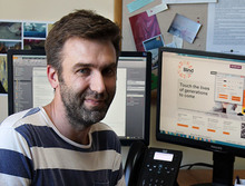 Tom Smith is an Accessible Information Consultant with the Blind Foundation.
He says advocacy for people with vision difficulties often focuses on people who are completely blind and who use screen readers. He believes, when it comes to website design, the needs of consumers with low vision are often forgotten.
"Contrast is the big one, making sure there's enough contrast between the text and the background."
He says black and white is a good combination, as is yellow and blue but two shades of the same colour can be hard to read. "There's quite a common trend now for light grey on dark grey and orange on white and those things usually fail quite dramatically."
He says another problem can be when websites colour code different parts of their content.
"They think this section of the website is yellow and this section is green and then they've totally lost the idea that there's any sort of readability with the content because they're so focussed on colour coding all their content."
Mr Smith says there are now tools available that can measure the contrast on a planned website using monitors in red, green and blue.
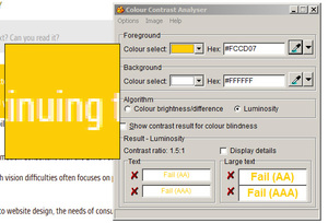
Software can analyse two colours to check the contrast between them
"There are some fancy algorithms they do with the values of the colours so we can actually measure two colours against each other."
This produces a numerical result and, ultimately, a pass or fail grade. "And that's really useful for us for when we're providing any advice or consultation and we can just say "Oh, look, this passes and fails". I’s not just our opinion that the colour contrast is bad in that sort of situation."
Mr Smith says there are software tools available to modify colours for individual users but he says ultimately website designers should be thinking about accessibility from the get go.
"What would be the best thing for us to improve it is better education, catching the people at the poly techs and universities and schools to make sure that these things are thought of in that design process."
The Low Vision Lifestyle
You've heard of a low budget lifestyle, how about a low vision one?
Almost 170 thousand New Zealanders have some sort of vision impairment, ranging from limited vision to complete blindness.
Most people are helpful towards those who are obviously blind but what if there's no guide dog or white cane?
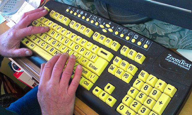
A keyboard designed for people with low vision
Twenty-one years ago Mike Stevens experienced a haemorrhage during an operation to remove a tumour from his pituitary gland.
Now he has just a quarter of the vision in one eye and, in the other, "no light perception at all, nothing!"
He says it’s a "small field of view" but he's learned to adapt. "Quite a lot of people are a bit bewildered when they really find out how blind I am really because I make a point of getting very familiar with my surrounds and [with] the art of bluff can get around reasonably well."
There have, of course, been a few accidents along the way and Mike says open cupboard and dishwasher doors present a particular challenge.
"I have a little saying where I'm nearly 100 per cent scar tissue 'cos I don't always get it right. [I have] a few wounds."
But, generally, not only does Mike navigate around his home town of Nelson with ease but he's also able to lead others down the garden path.
Showing One in Five presenter, Katy Gosset, the grow-house where he works, Mike explains that identification is achieved by remembering the locations of different plants. He uses his sense of touch to select the best blooms for market such as the green hydrangeas favoured by florists.
"The head of that is a perfectly roundish ball of green. Now that, against the green foliage, can be quite tricky for me to find and so I tend to have to go quite close."
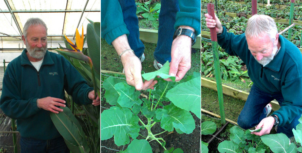
Mike Stevens at work in the grow house
The system isn't without its failings and Mike says some plants arrive at the florists with the odd, unwanted guest.
"Praying mantis and various other bugs and they don't like them in the shops but I haven't seen them so they go for the trip."
Mike's work is close to his home and he feels comfortable in this familiar territory but visual landmarks for the sighted, such as a large chrysanthemum bush, can become a known hazard for Mike. "I pick the flowers up off the footpath as I come past here nearly every day because they go quite slippery when they rot. That would make the footpath really quite slippery."
Heading home, Mike points out that his elevated front porch is a popular spot for watching sunsets. And while everyone's enjoyment of a sunset is slightly subjective, Mike's experience is something different again.
'I don't see the detail. I can see the hill-line far away and the shining on the sea over there but I really don't see the detail of the buildings down in town. "So it is a shame, I miss on some of the view."
But he says his condition has also brought new opportunities, including Outward Bound and the New York Marathon.
"I'm sure I would never have done that if I hadn't had a loss of vision."
Katy Gosset takes a tour around Mike's work place and gets a glimpse of life through Mike's eyes. She also talks technology with the Blind Foundation.